INCLUSIVE DESIGN - HOW DO YOU DESIGN QUEER JOY?
STUDIO WORROM founder Steph Morrow gives an insight into the redesign and the relaunch of a portal to ‘queer joy for queer kids’ - for Jong&Out, the world’s first LGBTQIA+ social app
xxx

Former VIRTUE (VICE) head of strategy, Steph Morrow, is the founder of strategy studio STUDIO WORROM, a queer champion in the advertising industry, and the mastermind behind a creative campaign to re-launch the world’s first LGBTQIA+ social media platform.
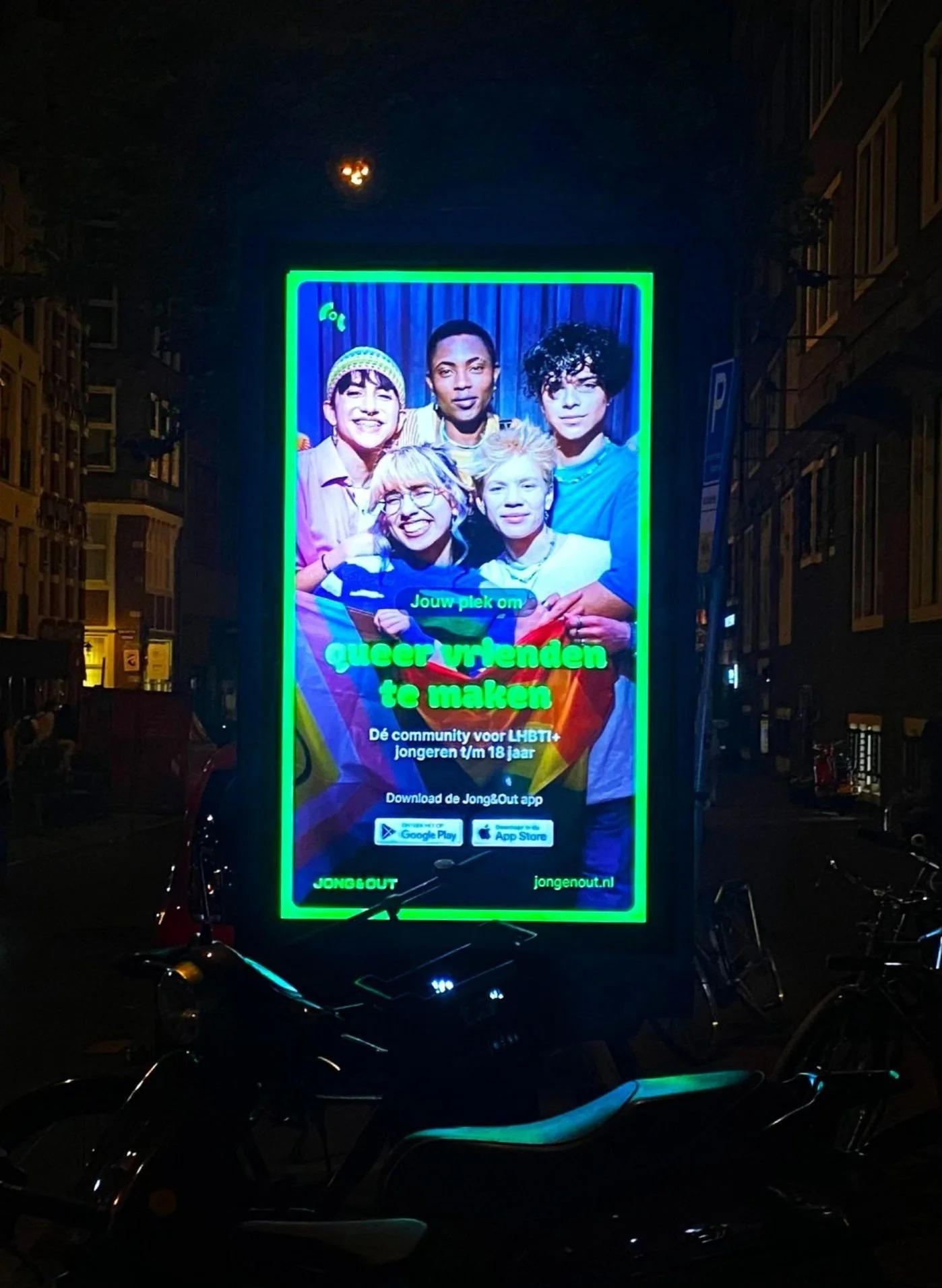
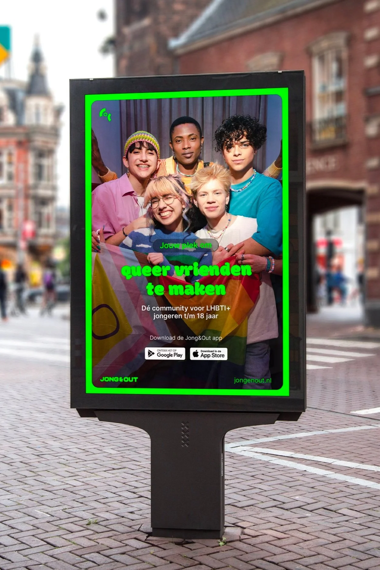
Some of the strongest LGBTQIA+ talent in Amsterdam’s creative agency landscape collaborated to create this powerful campaign which was visible online but also on billboards throughout the Netherlands to relaunch the Jong&Out app. Celebrating the many facets of queer joy, the campaign is centred on the idea of a space that young LGBTQIA+ people can define themselves for themselves - something the entire pro-bono team wished they could have had access to as queer teenagers.
We caught up with Morrow to hear more about the process - and about how to design the experience.
xxx
As well as the campaign film and social activation element, you created a new visual identity for the app and website – how did that tie into the theme of queer joy?
Underpinning our whole strategy is positioning this platform as a portal to queer joy for queer kids. In regards to design, that meant both "queering" the visual system to make it inclusive for all queer teens, as well as a system that stands out and feels new and exciting. Fran Marchesi, Creative Director James Holdsworth and Art Director Astrid Niari, are obsessed with this part of the process.
We knew we wanted to use a bright and contrasting colour language that really popped out from the screen, so we chose a vibrant colour palette reminiscent of Pride flags lying side by side. It immediately felt joyful, but also distinctly queer, as well as reflective of the spaces the audience is currently using online such as Twitch and Snap.
The other key consideration for us is that given this is a social network and most importantly, a community, we wanted to create a set of design elements that the teens could use themselves on social media. We kept the logo treatment minimal to give us the option to animate and stack it in fun ways so that it could be turned into a range of stickers and GIFs the kids could share on social signalling their attendance at meet-ups. Our expressive typeface was chosen for a friendly, welcoming vibe, which can also be used in playful, joyful expression that works harmoniously with our logo.
xxx
With all the recent celebrations around Pride, it’s easy to forget that there’s still a huge amount of anti-LGBTQIA+ sentiment and challenges facing the queer community - queer youth in particular. Was that a driver in your decision to get involved with the campaign?
Creating this campaign was a real healing but at times emotional, experience for the whole team. All of us experienced either outright bullying or microaggressions as kids growing up queer - so we channelled our experience into making this campaign great and impactful because we knew what it could have meant to us if we’d had this incredible platform as teens. The attack in Eindhoven also happened right in the middle of developing this platform, which hit so close to home. When you come face to face with queer kids, it’s unthinkable they’re being targeted with homophobic acts of violence, and it makes you want to do everything you can to protect them. So, by far the most rewarding aspect is knowing how helpful this resource will be: the ultimate embodiment of using your skills and knowledge for good. Every queer kid we get to join this app is a kid we’ve connected to a mental health lifeline.
As a queer member of the advertising industry, why was it so important to have a representative team on the project?
As creative professionals, we spend so much time honing our skills on commercial projects, but it’s rare you get a chance to use your skills in a way that both gives back to a community close to your heart and actually leverages your skills in a way that makes a huge difference to the impact a project can make. In this case, it was super clear that having a really strong team of queer strategists, creatives, designers, producers and media people would make this exponentially more impactful. As queer creative people, there also aren’t that many of us, so we mostly know each other, especially in a small city like Amsterdam. Luckily for me, everybody I asked saw the potential in the project too and happily got on board pro bono. The potential for helping queer kids is the most motivating thing in the world.
There is also a very real thing where queer representation in agencies is still so sparse that you often find yourself as the token queer person on Pride projects, and for us with this project, it was immediately clear it would only resonate if we were able to really demonstrate our understanding of queer cultural references across the queer spectrum, with a team that reflected different facets of the queer experience. This was something I talked a lot about with my creative partner and co-leader of this project - the Executive Creative Director on the project, Fran Marchesi. We knew it was crucial to nail that balance and bring in the right mix of people to ensure we were reflecting the lived queer experience in numerous facets, not just from a single vantage point.
Why does this work matter for queer youth – and the wider LGBTQIA+ community?
By far the most rewarding aspect of the project is knowing how helpful this resource will be. It is the ultimate embodiment of using your skills and knowledge for good. Every queer kid we get to join this app is a kid we’ve connected to a mental health lifeline. Next to that, getting to work alongside other queer creatives like Fran Marchesi has been a joy and a privilege. It’s no exaggeration to say we’ve become best friends in the process. I think you can feel how much fun we have had in the work, too. It’s just been an absolute joy and the work reflects that: pure queer joy.
Were there any other considerations you had to take into account in the redesign?
Inclusion is also of course central to this project, so when defining our playbook, Fran and I made sure we were working to the WCAG guidelines for full accessibility across all audiences. Any single colour can be used as a highlight, but two or more may only be used in specific configurations for the correct contrast to ensure legibility with colour-blinded or visually impaired audiences.